10 Beautiful Websites of Herbal Brands for Inspiration (Part I)
Graphic design & Photography
In today’s digital age, a beautiful website serves as a window into your brand’s soul. Your online presence not only showcases your products but also conveys your brand’s essence. It’s a canvas where creativity meets functionality, and where aesthetics blend seamlessly with purpose. In this series, let’s explore 10 beautiful websites of herbal brands that masterfully blend aesthetics with purpose. These web designs, each a showcase of creativity and innovation, not only inspire the herbal products industry but also captivate anyone with an appreciation for the art of web design.

1. Gaia Herbs
Gaia Herbs, a well-known herbal supplement and wellness company, specializes in crafting high-quality herbal extracts, supplements, and health products sourced from organic and sustainable herbs, recognized for their herbal purity and potency.
Their website embodies captivating and cohesive design that seamlessly aligns with their brand identity. A thoughtfully chosen color palette, ranging from serene light greens to deep, earthy shades, creates a natural and organic ambiance that beautifully complements their product range. The use of hand-drawn style icons not only infuses a unique charm but also emphasizes their use of natural and organic ingredients. In addition, their online shop elevates product presentation by showcasing beautiful packaging and labels, reflecting their dedication to quality and holistic well-being.
Gaia Herbs’ website uniquely enhances trustworthiness through its partnership with Gisele Bündchen, prominently featuring her stunning images. This combines the power of a celebrity endorsement with their dedication to natural and organic values, strengthening their brand’s credibility and allure.
Gaia Herbs’ website enhances trust through its partnership with Gisele Bündchen, prominently featuring her images. This combines celebrity influence with their natural and organic commitment, reinforcing their brand’s credibility. Their consistent branding, color choices, hand-drawn elements, and packaging design create an engaging experience, fostering trust and connection with their audience.
Gaia Herbs’ dedication to herbal purity, sustainability, and holistic well-being shines through their website, reflecting their core values.
2. Starwest Botanicals
Starwest Botanicals specializes in offering a wide range of botanical products, including herbs, spices, teas, and 100% pure essential oils. They are known for their commitment to providing high-quality, organic, and sustainably sourced botanicals to customers.
Starwest Botanicals’ website features a clean and visually appealing layout, featuring earthy tones that evoke a natural and organic feel. The deep green-brown and warm burnt orange primary colors give the site a rustic yet stylish look. Even the sign-up form is thoughtfully designed to match the brand’s style.
In terms of typography, they use the modern and easily readable Montserrat font as the main typeface, while the accent font Georgia adds a touch of classic elegance. Hand-drawn style icons for product categories enhance user navigation and add a delightful element to the website, similar to what we saw on Gaia’s website.
One standout feature is their captivating product photography, with items thoughtfully arranged and tastefully presented with props. In the shop section, raw herbal products are displayed on white plates, photographed from an overhead angle, resulting in a consistently appealing visual presentation. This clean, minimalist approach helps shoppers understand and explore each item more effectively.
Altogether, these design elements and stylish photography make Starwest Botanicals’ website an appealing destination for health-conscious consumers.

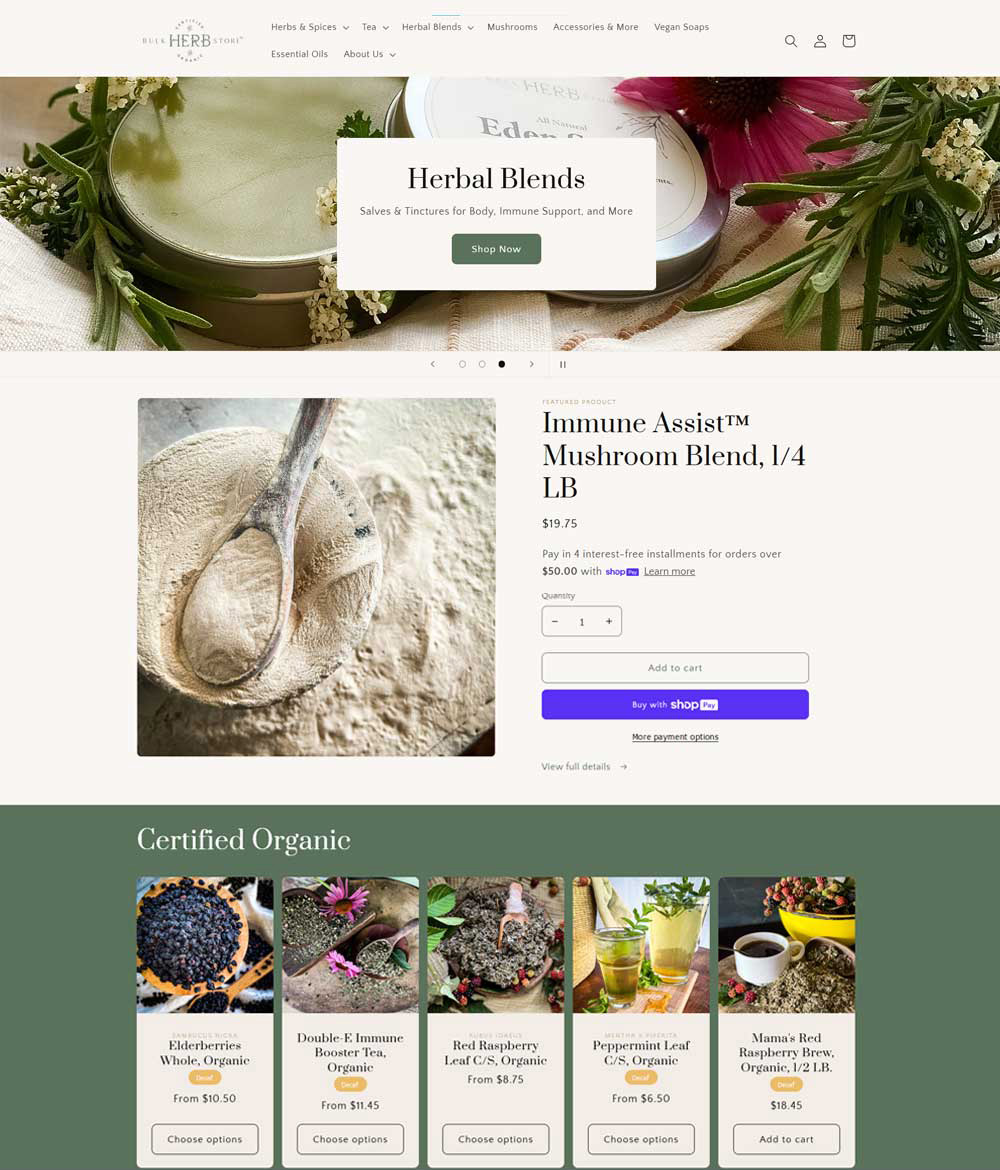
3. Bulk Herb Store
Bulk Herb Store, a haven for herb and spice enthusiasts, offers a carefully curated collection of certified organic herbal teas and spice blends, inviting culinary exploration and herbal traditions. Their website reflects a reverence for herbs, bringing nature’s treasures to the digital realm.
A calming and soft shade of olive green, their primary color choice, infuses the site with a natural and organic essence, harmonizing with the brand’s dedication to all things natural and organic. In terms of design, it shares some similarities with Starwest Botanicals, especially in lifestyle images showcasing products with tastefully selected props.
What sets Bulk Herb Store apart from StarWest is its use of lifestyle imagery, even within the shop section, contrasting with StarWest’s minimalist style. Each image tells a story that beautifully connects with the essence of the product, inviting you to enjoy life’s simple pleasures.
One of my favorite aspects is the “Certified Organic” section, where five tea products are elegantly displayed in vertical boxes reminiscent of tea packaging labels. This clever design enhances visual appeal and seamlessly integrates with the products, offering an engaging user experience.
Inspired by the world of herbs and spices, Bulk Herb Store’s website design beautifully reflects their organic commitment. This design amplifies their dedication, making them a top choice for enthusiasts where culinary possibilities and herbal traditions thrive through their captivating web design.
4. Rebecca’s Apothecary
Rebecca’s Apothecary is on a mission to connect their community with the world of botanical medicine through the provision of raw materials, education, and meticulously crafted products.
The website seamlessly blends nostalgia with contemporary aesthetics by using the Arvo font for headlines and titles. This typeface, with its geometric slab serif style, evokes classical and old-fashioned vibes, reminiscent of typewriter documents and 19th-century British newspapers.
What sets them apart is their choice of a warm color palette, featuring rich maroon and deep burgundy, introducing a touch of femininity and highlighting their status as a woman-owned business. Rebecca’s welcoming smile on the homepage adds a personal touch to her brand, building a connection with customers and enhancing the authenticity of her business.
A notable design element can be observed in the presentation of tea leaves and herbal products within the “Herbs + Teas” section of the online shop. Each raw material is thoughtfully arranged against a clean, white background, emphasizing the authentic ingredients and the product’s inherent freshness. In the “Body” section, products in glass bottles or jars feature labels with vintage-inspired typography recalling old-time medical labels. Additionally, the photographs of these bottles display the liquid’s color, providing customers with a clear visual representation.
Rebecca’s Apothecary delivers a unique experience that blends contemporary design with typography that channels classical and old-fashioned vibes. Their unwavering focus on product authenticity and freshness, coupled with Rebecca’s personal connection with her brand, sets them apart in the world of botanical medicine.

By exploring these four captivating herbal brand websites, we witness the seamless fusion of aesthetics and purpose. Each website is a vibrant landscape where design elements harmonize with the brand’s mission, creating a visual symphony that resonates with herbal enthusiasts. The use of captivating graphics, lifestyle imagery, and thoughtful design choices not only elevates the online experience but also deepens the connection between these brands and their audience. Join us in the next part of our series as we continue to explore enchanting websites that embody the art of blending aesthetics with purpose in the herbal world.

Let's Chat & Discover Together
CopyRight © Safflora Atelier 2024 | Privacy Policy